I’m talking about dashes — the under-utilized cousin of parentheses and commas — and their often confused, more distant relative, the hyphen.
Hyphens (-) are the easiest to type quickly on your computer or mobile keyboard. They’re just one keystroke, no shortcuts, no searching through special character menus, and therefore often over-used when a dash might actually be needed.
There is a long and somewhat confusing list of possible uses for hyphens, but they are mostly used with:
— compound modifiers, when they precede a noun (e.g., “mass-produced goods”) or follow some form of the verb “to be” (“The teacher is well-known.”)
— with numbers like phone numbers (“555-867-5309”) and ages (“12-year-old boy”), but they should not be used for numbers in a range; we’ll get to those later
— certain prefixes (e-newsletter, ex-wife or pre-Civil War) and suffixes (Sinatra-esque or child-like)
The blurred lines about dashes
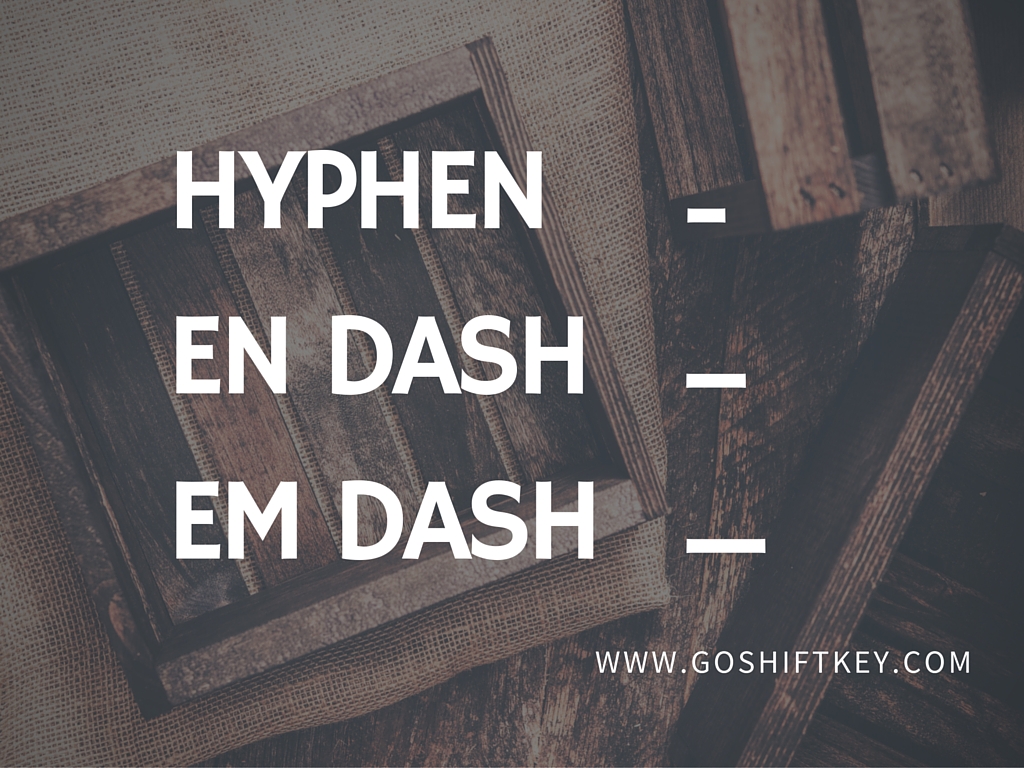
Where most people start to scratch their heads is the idea that there are two types of dashes, en dashes and em dashes. Unless you are a writer or editor, you may have never heard of or noticed this. After hyphens (-), the difference between en dashes (–) and em dashes (—) is quite literally the one additional character width that you can see in each parenthetical example provided. Using the words “en” and “em” speaks to the history of how these came about in the days of actual typographers and typesetters. “En” dashes were originally the length of the typeset letter “N,” while “em” dashes were the length of the letter “M.”
Rather than fish through menus to “insert special character,” some people type two hyphens consecutively to approximate a dash. Different PC and Mac shortcuts are available to create both types of dashes, and Microsoft Word will often auto-correct to an en dash (not an em dash). Is it any wonder that people get all of these confused?
The confusion is mainly about how technology has changed the way we use punctuation. What was once the job of a typesetter using small metal blocks for each character, became a typewriter, then a computer.
Regarding their usage, a cheat sheet for the different types of dashes is as follows:
En dashes (–), the shorter of the two in length, are used much less frequently, and usually deal with ranges:
— joining numbers in a range, such as years (1993–1995 or pages 5–7), or a range indicated with words (July–August 2015). Why not use a hyphen? Some computers can mistake this for a minus sign.
— partnerships (the Dodd–Frank Act) or comparisons (the Obama–McCain debate) where the meaning would be muddied by using a hyphen (the Spanish-American War has a different meaning than the Spanish–American War; one took place in Spanish-America, and the other indicates a war between two separate entities)
Em dashes (—) are what is being implied most of the time a dash is referenced. They are usually used:
— with lists, such as this one (the Associated Press or AP Stylebook prefers this over bullets)
— to indicate an abrupt change of thought within a sentence
— to set apart a series within a sentence (“She preferred colored M&Ms — red, green, blue and yellow — over the brown ones.”)
— to attribute a quote (“The road to hell is paved with adverbs.” — Stephen King)
— in datelines (NEW YORK (AP) — The Dow plummeted again today.)
Some may think em dashes are over-utilized, but those who use them freely would cite that they contain more emphasis than a comma, are less awkward or less visually obtrusive than parentheses, and can be used in place of semicolons or colons in different scenarios. Versatile little tools they are.
How does this all go down regarding spacing?
Have you ever read an article online and noticed some publications—maybe blogs, pop culture rags or magazines—use no spaces on either side of an en or em dash (as shown with this sentence)? This seems to vary widely across the web and is largely a personal preference as decided by respective publications and their respective style guides.
But officially, AP Stylebook says to put a space on both sides of the dash for all uses “except the start of a paragraph or sports agate summaries.”
Most newspapers use AP Style. And most but not all newspapers follow AP’s suggestion regarding the dash spacing as well. USA Today, The Wall Street Journal and The New York Times — the top three U.S. newspapers by the circulation numbers — use AP Style spacing suggestions, for example.
And if you couldn’t already tell, Shift Key follows AP for the most part, unless designated otherwise by a client.
Hyphe-you’re-makin’-me-crazy
When it comes to hyphens, en and em dashes, commas, parentheses, colons and semi-colons, can there be too much of a good thing? According to both the Associated Press’s “Guide to Punctuation” online and The Elements of Style which serves as a sort of “writer’s bible,” yes and yes. This excerpt, from the book:
“Clarity, clarity, clarity. When you become hopelessly mired in a sentence, it is best to start fresh; do not try to fight your way through against terrible odds of syntax. Usually what is wrong is that the construction has become too involved at some point; the sentence needs to be broken apart and replaced by two or more shorter sentences.”
When dealing with the written word, in lieu of overusing punctuation, nothing helps the reader to digest a wordy sentence better than following up with a short sentence. Trust me.
Sources: apstylebook.com, quickanddirtytips.com/grammar-girl, grammarist.com, dashhyphen.com, punctuationmatters.com
At Shift Key, we make communication capital. We are journalists who know how to create original content, the foundational layer of digital marketing. We understand audience and the information your audience wants — whether you are an agency, brand, company or non-profit. Content is the bedrock of digital marketing. Shift Key creates unique and informative content that feeds marketing activities across a mounting number of channels, generating buzz for brands and leads for products and services.