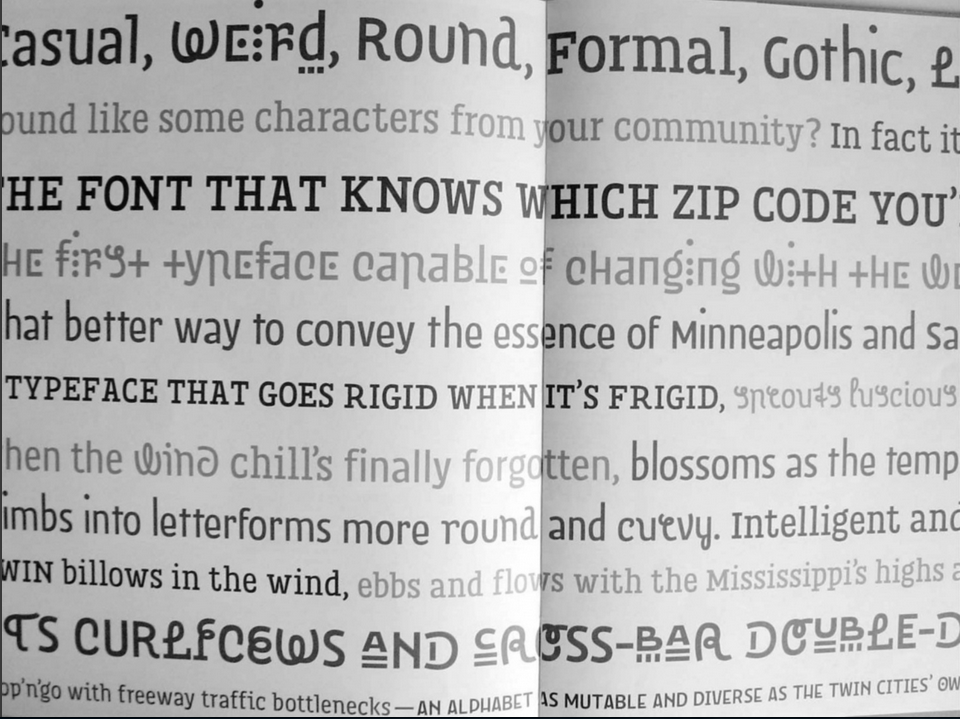
Do certain fonts remind you of certain places? More pointedly, can a typeface really represent what’s unique about a city?
Remco can de Craats thinks so. Van de Craats, co-owner of one of the a design firm in Eindhoven, Netherlands, has been tasked with coming up with a new typeface to represent his city. Eindhoven, he says, is a city “very much in transition.” According to an article in The Guardian, van de Craats says that type has a lot of effect on the atmosphere of a place. He calls it “the voice of the city.”
Even though you might not be able to call a certain typeface by name, chances are you associate certain fonts with certain places. Many of the world’s largest cities’ image is intimately tied up with a specific typeface. Think London Underground or New York’s subway signage. But even smaller cities like Chattanooga are working to develop their own fonts for city signage and identity. The movement, called Legible Cities, is gaining momentum.
Does your city have its own font? Does it need one?
To read the complete article, click here: http://www.theguardian.com/cities/2015/jan/13/subliminal-power-city-fonts-typeface-design
Advertisement

