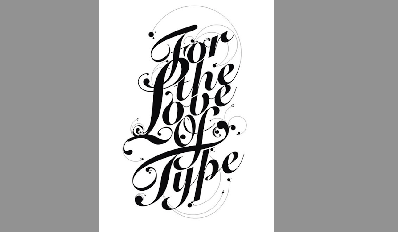
By Tiffany Wyatt
With so many options of fonts available, choosing the right font for the job can be overwhelming — but the bottom line is that the proper font choice can make or break a design. The proper font can make your design stand out and get your text to jump off the page, sending the right message to your target market.
To make the best font choice, here are five basic considerations:
- Hierarchy
Typographical hierarchy is the order is which your content is read. Primary elements are strong and dominant. Choose a large, primary font for your title, then a visually secondary font for the subtitle, and then move down in size for the body of the piece. With this basic method, you have the power to control how the audience reads your project.
2. Contrast
Contrast can be created in several ways. One option is using a line of text in lower case in a larger point size and another a line of all upper case in a smaller point size. Another option is simply using different fonts that contrast in weight, one heavy and one light. Generally the more contrast, the more they compliment each other. When using different fonts, try to find ones that are not too different in style but are different in others ways like weight and width.
3. Legibility
With so many beautiful and fun fonts available today, be sure you chose ones that are easy to read, especially when working with longer sections of text. Generally serif and sans serif fonts are the best for this application versus script or upper case fonts. A second aspect to consider is the background the text sits on being of contrasting value. A dark background will work best with white or light text and vice versa.
4. Lead & Kern
Perfection in your text can be reached by adjusting kerning and leading.
Leading determines the space between lines of text which is the distance from the bottom of the words above to the top of the words below. That space should be appropriate to make the text legible. Make sure your descenders and ascenders of your font are not allowed to touch one another. Kerning is the space between the letters. When letters are too close together they appear jammed and impossible to read, while too far apart text is simply awkward. Be sure to have proportionate kerning between each letter of the same word.
5. Appropriate style
When choosing the right fonts for the job, be sure to take into consideration the different aspects of the piece. What is the project informing the public? Who is the target market? What is the personal style of your client? Is the design casual and fun or corporate and on the stiff side? Understanding these details of your design will help lead you in the right direction in your font selection. Each font has its own personality. Let that personality bring your design to life.
With all things— rules are made to be broken. Be creative and experiment with fonts and something amazing is guaranteed to happen. And always, always have fun!